Story:
In 1987, in a quiet village surrounded by green meadows, a loving family established the "Meadows Grill" restaurant, a place that carried the warmth of hearts and the flavors of grilled meats. The beginning was humble, as the family gathered around a small table to plan this unique journey.
They started transforming a small green land into an oasis for meat lovers, constructing a modest building that harmonized with the surrounding nature. They decided to name their restaurant "Meadows Grill" to reflect the spirit of the place and the beauty of the surrounding landscape.
From the very first day, the family dedicated their efforts to selecting the best types of meats and preparing them with care. They relied on traditional recipes with a modern touch that added a unique flavor to the dishes. The experience of cooking together brought them closer, with each dish telling a story about the family and their love for cooking.
Over time, "Meadows Grill" grew to become an unmissable destination for meat enthusiasts. The atmosphere inside the restaurant was always filled with laughter and joy, turning the place into not just a restaurant but a community where friends and families gathered to enjoy a unique experience.
Pictures of family cooking and the restaurant's evolution adorned the walls of "Meadows Grill," becoming an integral part of its identity. In this way, the restaurant acquired a long history of success and development, and anyone who entered felt as if they were coming to their second home, where delicious food and warm hospitality awaited.

Concept:
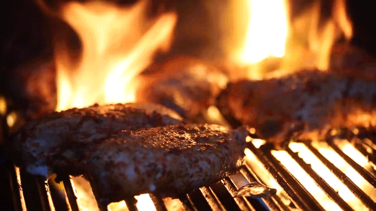
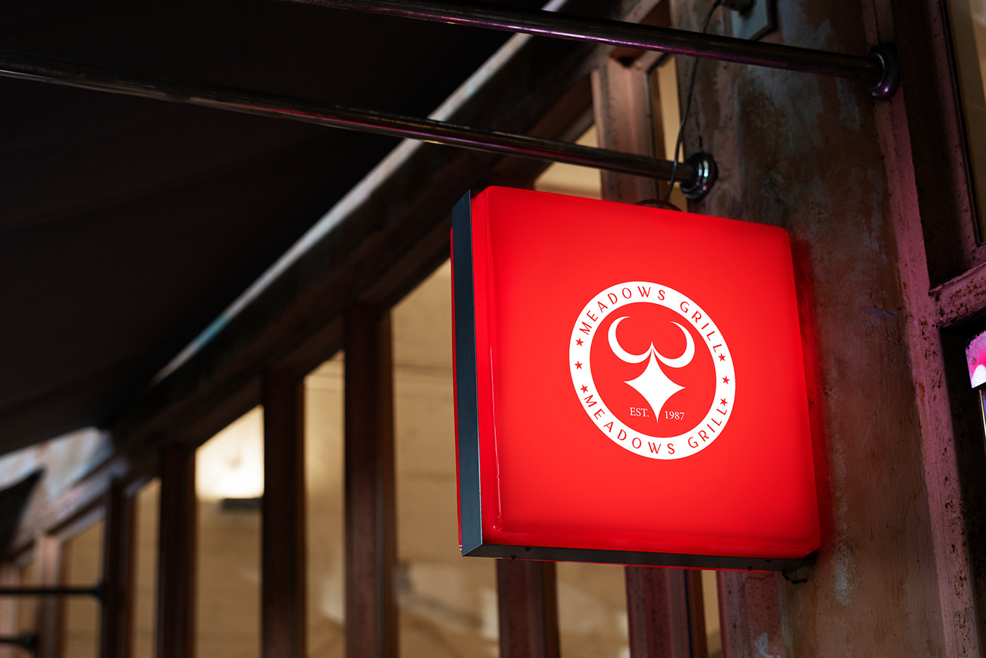
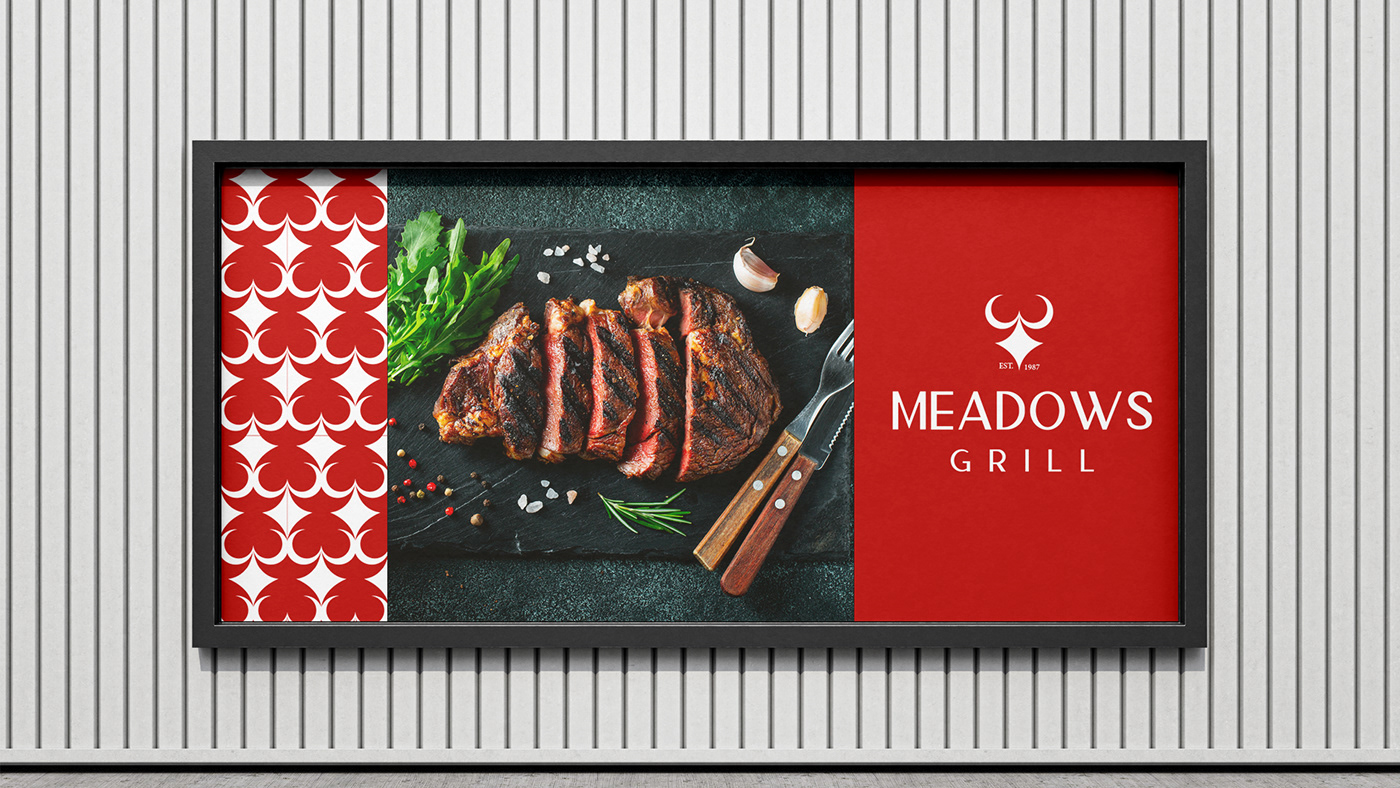
Meadows Grill is a restaurant that specializes in grilling and cooking beef and bull meat, but it is very distinguished in cooking bull meat. It has a culinary touch that makes the meat have a very unique and distinctive taste. This is the part dedicated to the logo.
I have combined the star shape to indicate distinction and individuality and I have created The logo is in this shape to indicate luxury and ease of stability in the minds of customers. I have made the shape very simple because the logo will be used in many things such as business cards, seals, office papers, menus, and social media.
Therefore, the advertisements made the logo's shape very simple and understandable, and also easy to remember and also distinctive, and this is the concept of the logo

.

Pattern

About color:
The dark red color, or burgundy, is considered a strong and eye-catching color. This color is associated with several meanings, including:
Luxury and Opulence:
Dark red is considered a luxurious color and is often used to distinguish high-end products or brands.
Emotion and Enthusiasm:
Red is linked to strong emotions and enthusiasm, representing passion and vitality. It can be used in places or situations that require a lively atmosphere.
Power and Authority:
Red is associated with power and authority. It can be used in branding or visuals for those who want to emphasize strength and control.
Romantic Emotions:
Red is attributed to romantic emotions and sentimental feelings. It is often used in romantic settings or special occasions.
Energy and Activity:
Red is linked to increased energy and activity. It can be used in some cases to stimulate movement and promote activity
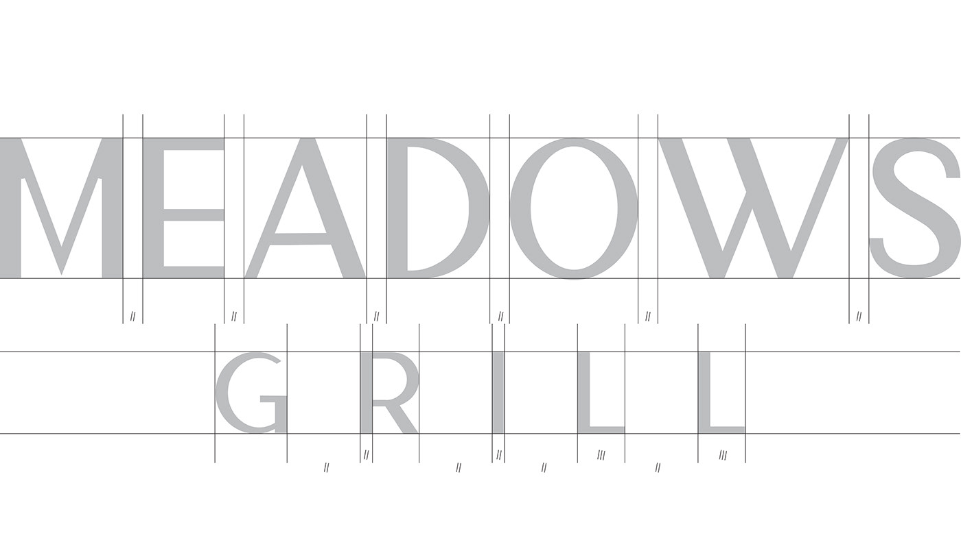
Equal letter spacing:
Making the spacing between each letter equal, also known as equal letter-spacing or kerning, enhances the balance and aesthetics of text design. There are several benefits to this practice:
Easy Reading:
Equal letter-spacing aids in making the text more readable, providing a visual balance that contributes to better word comprehension.
Visual Appeal:
Balancing letter spacing visually enhances the attractiveness of the design, making it more appealing.
Professionalism:
Equal letter-spacing is considered a sign of professionalism in design, reflecting attention to detail.
Structural Balance:
Equal letter-spacing is part of achieving balance in the structure of the text, allowing the eye to move smoothly across the lines.
Improved Understanding:
This type of spacing helps improve text understanding, making the text more focused and organized.
Aesthetic Impact:
Equal letter-spacing adds an aesthetic impact, making the design more visually appealing.

About Font:
The term "Cremona line" typically refers to a horizontal line resulting from natural or artificial lighting, created by the intersection of shadow and light. This line is characterized by separating an illuminated area from a shadowed area, and it becomes clearly visible on surfaces.
Cremona lines occur when light infiltrates a specific area, such as a window opening, forming a horizontal line between the wall and the ground or between different surfaces. This line can be prominently seen in places where intense lighting and shadows are distinct.